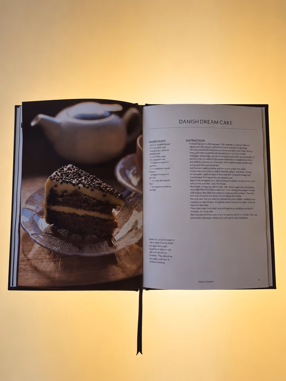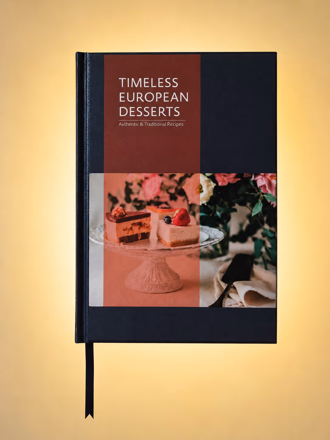
Timeless European desserts continue to captivate aspiring chefs and culinary enthusiasts seeking to bring authenticity and cultural depth into their kitchens. The target audience values tradition, precision, and clarity in presentation. The cookbook needs to reflect European heritage and sophistication while maintaining a clean, intuitive layout that allows readers to follow recipes with ease and confidence.
Exploration included different layout structures ranging from image heavy compositions to more text driven pages. The final direction prioritized clarity, rhythm, and visual balance to guide the reader naturally through each recipe.
The art direction was selcted through a series of high end dessert photography with higher contrast and resolution to strengthen the visuals throughout the cookbook.
Careful attention was given to the colour palette as each section is the countries flag colour with the title being the main visual for each.
This project strengthened my ability to design structured layouts that balance functionality and visual storytelling. It reinforced the importance of hierarchy, spacing, and typographic clarity when presenting information heavy content such as recipes.