The project involved developing a rebranding visual for Appetite for Books. The goal was to create a brand that communicates both the literary and culinary aspects of the concept while remaining clear and recognizable.
The branding needed to balance approachability with clarity, ensuring that the identity feels inviting while maintaining a cohesive visual system that could extend across multiple applications.
The design approach focused on developing a visual identity that reflects curiosity and creativity while maintaining a clean and structured aesthetic. Initial exploration included experimenting with typographic treatments and graphic elements that reference both reading and culinary culture.
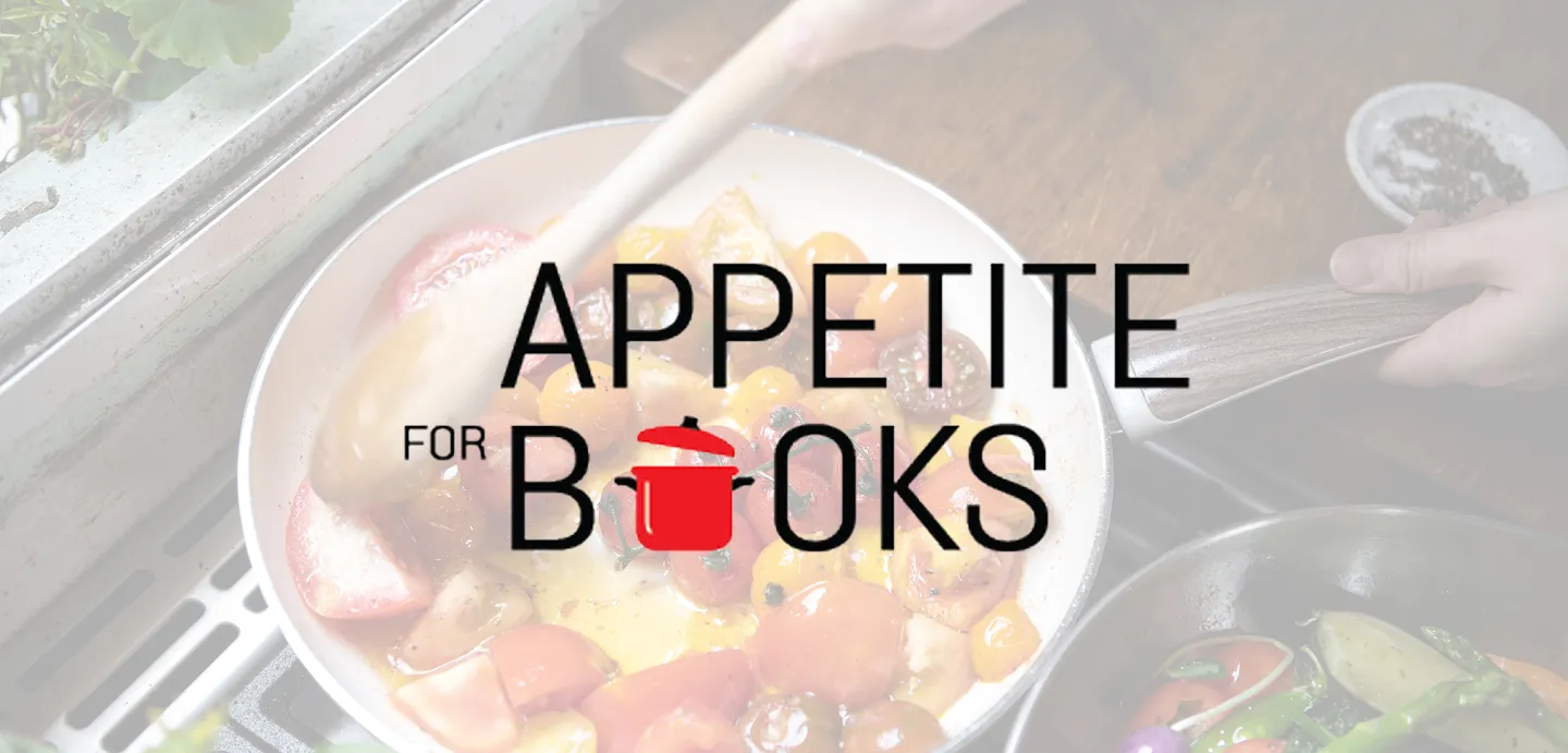
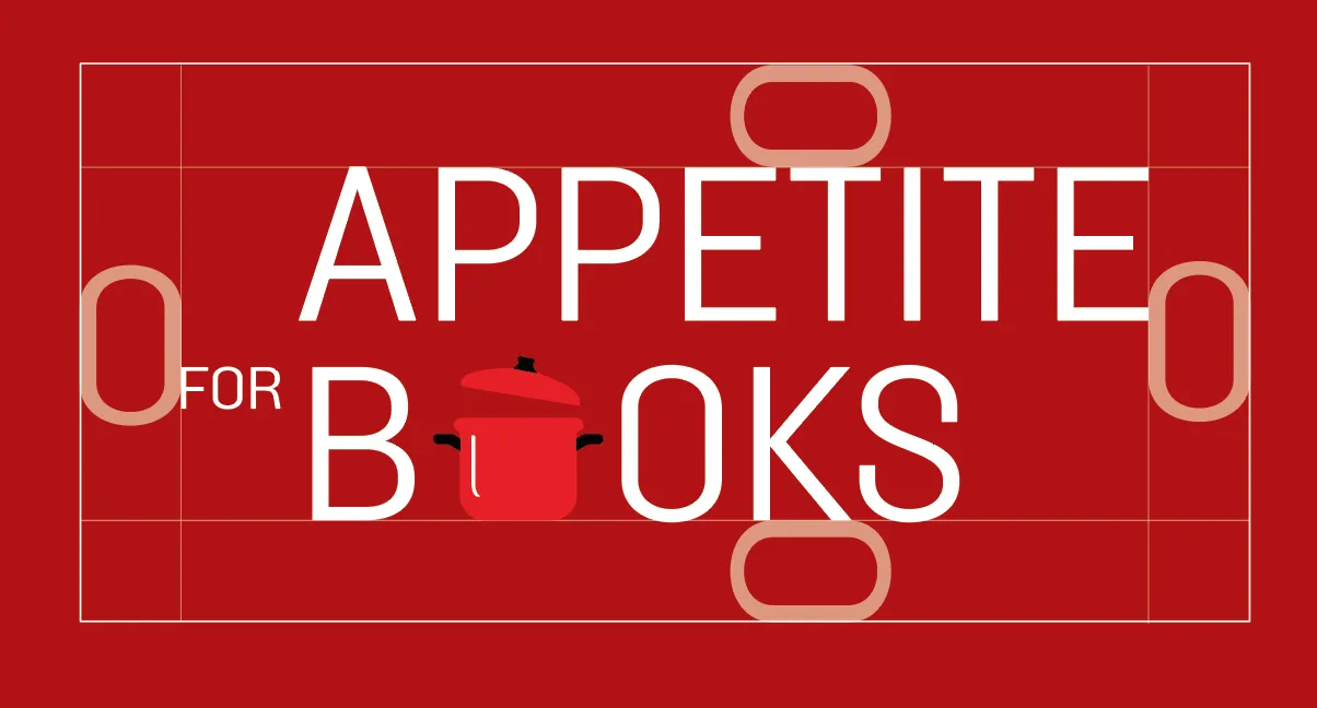
Different concepts were explored to determine how the brand could visually communicate the relationship between books and food, such as multiple different culinary equipement acting as a wordmark, food inspired concepts occupying the type and finally landing on a cooking pot partially opening to emphasize curiosity behind cooking.
Multiple different typographic directions were considered and explored such as sans serif and serif typefaces, bold and regular. Finally choosing solido as the font symbolizing clarity and a welcoming feel for potential clients.
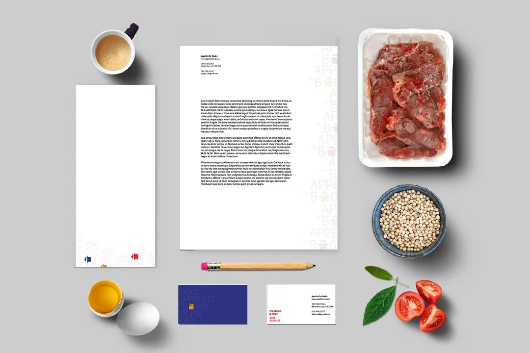
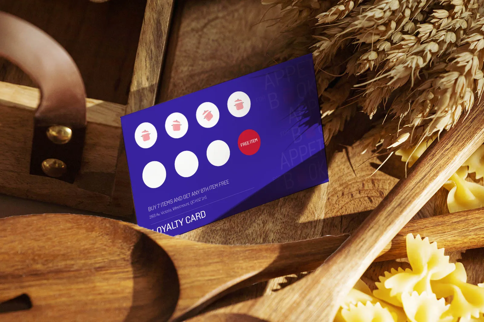
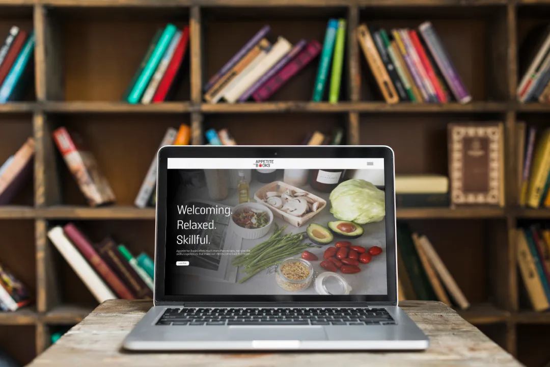
The design system also includes stationary with a graphic system showing the different food subjects, such as vegan, Meats and Pasta. The logo mockups will fit the brand aesthetic such as an event vehicle, advertisements, website, storefront signage and more.