Marche Public de Montreal is a network of public markets that connect local producers with urban communities. They provide year-round access to independant local merchants, farmers and fresh, local, and diverse produce, connecting residents directly with local farmers, artisans, and retailers.
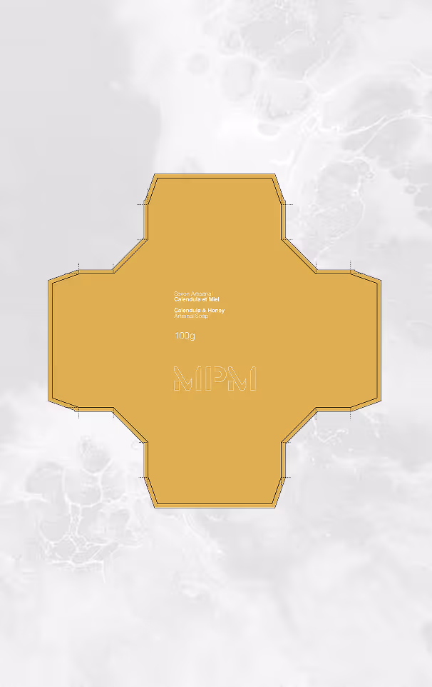
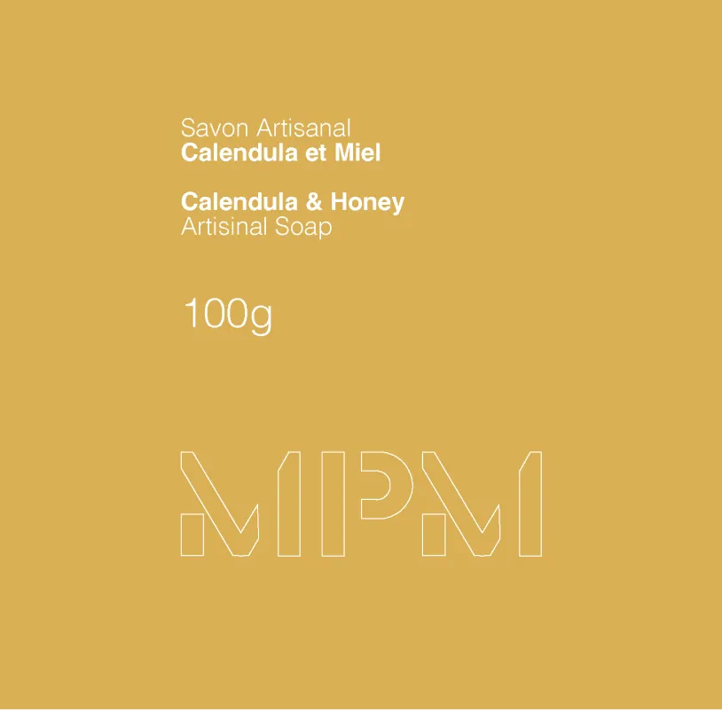
The concept direction is focused on expressing authenticity through restrained typography and a controlled layout system.A dieline technic was implemented into the packaging to reinforce the brand “MPM” while giving clients a window to allow for scent of the product.
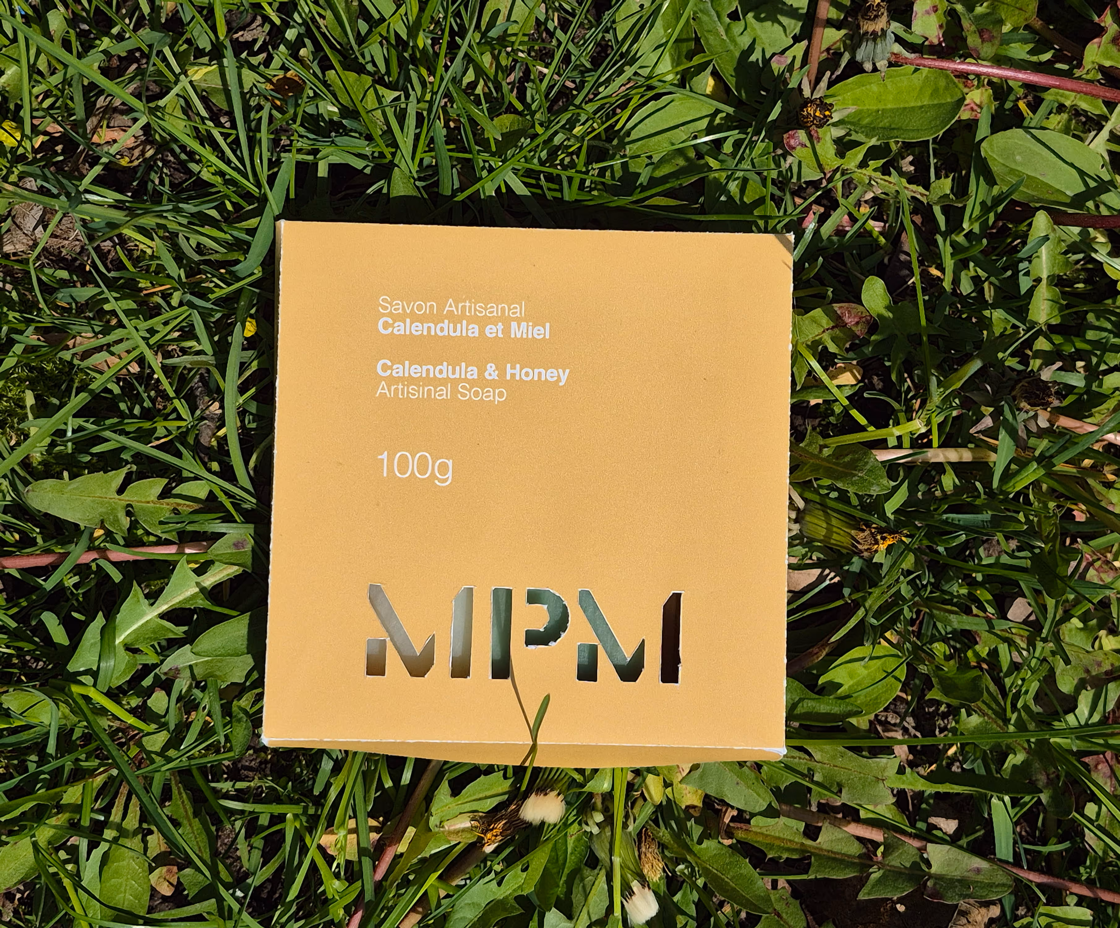
Typography was selected to emphasize simplicity and readability while subtly referencing traditional craftsmanship. The font used was sans-serif as its clean and coherent better matching the eco friendly and locally made packaging product.
.avif)
The final packaging system achieves a balance between warmth and precision, reinforcing both the handcrafted nature and the premium positioning of the brand.
This project reinforced the importance of aligning material qualities, typography, and layout systems with brand positioning. It strengthened my ability to translate conceptual direction into a coherent packaging system while maintaining clarity and intentional design decisions throughout the process.