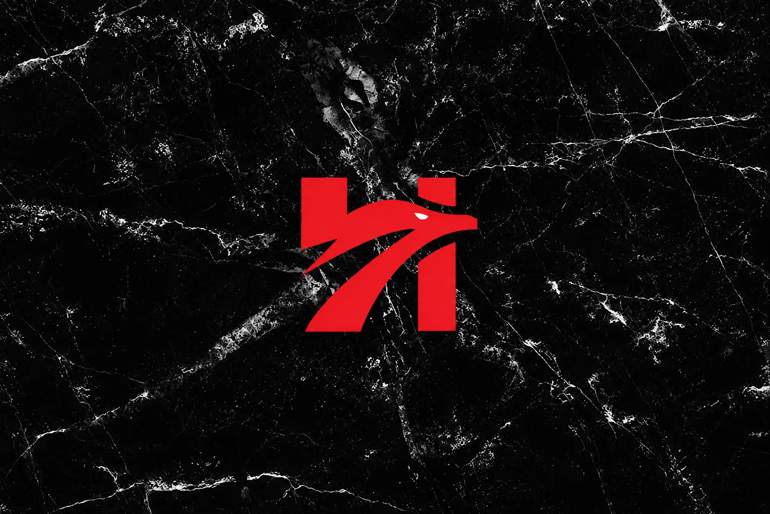
The objective of this project was to evolve the brand’s existing identity while introducing a refreshed and elevated visual direction.
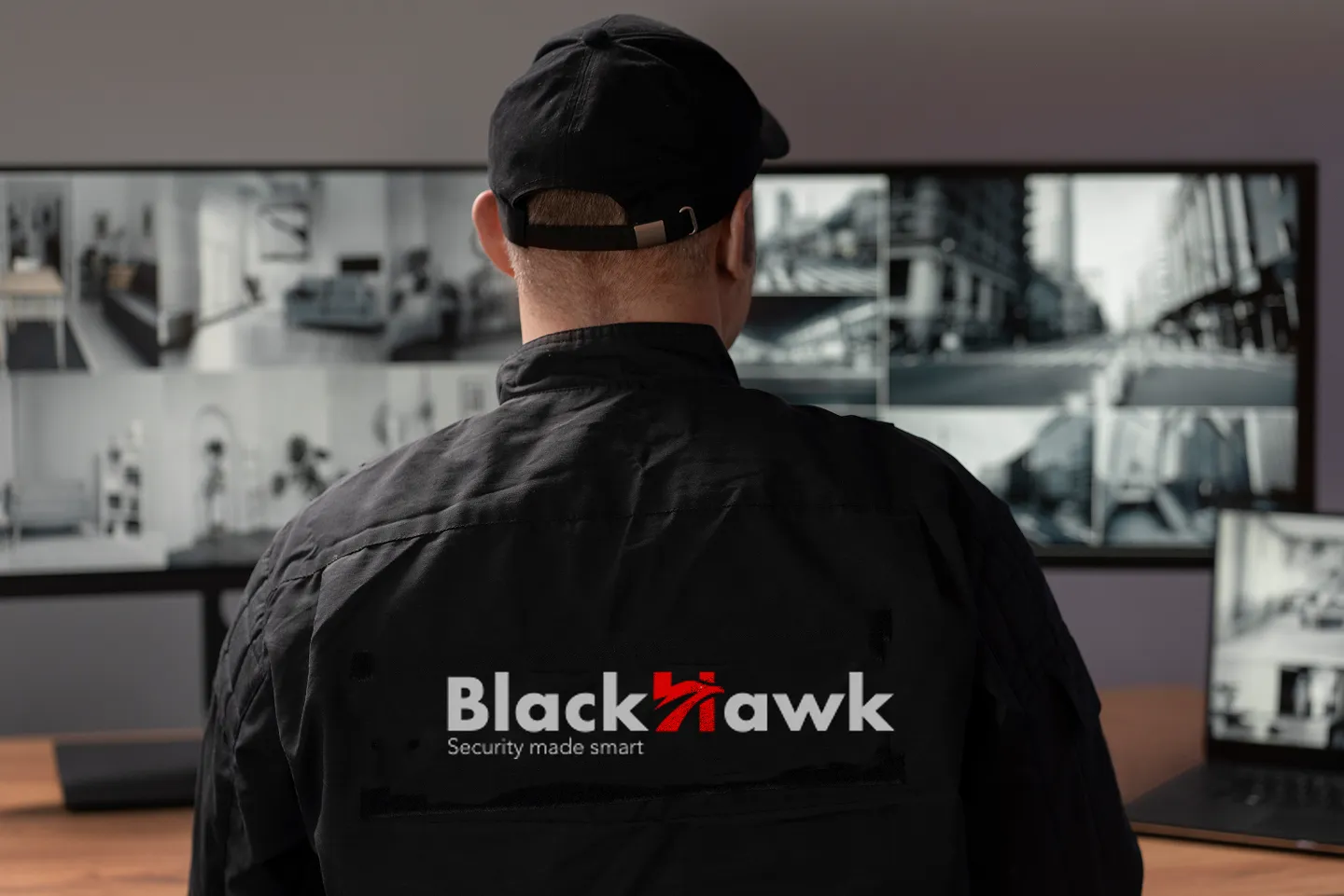
The design needed to remain aligned with BlackHawk Security’s established presence, yet communicate a renewed sense of sophistication and authority to prospective clients.
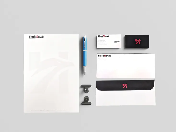
Typography selection proved to be a critical component of the process. The typeface needed to project both belligerent and professionalism qualities not easily achieved simultaneously. After extensive exploration, a futura bold was selected that reinforces authority while maintaining a clean, high-end appearance.
The project taught me that one typographic element and the right colour palette can be subtly turned into the main visual without needing a whole new transformation, resulting in a professional and belligerent logo.